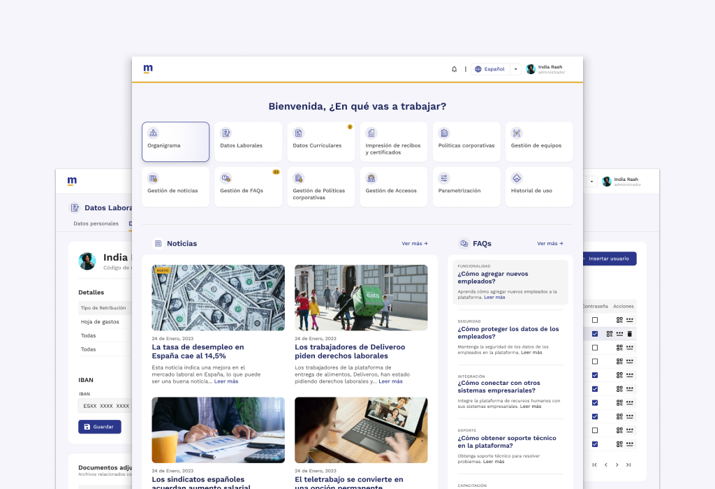
Design of HR management platform for Seresco, the leader in Spain in payroll software.
Company: Seresco is a leader in payroll outsourcing in the Iberian Peninsula
Problem: The company needed to update its Milena product and create a single Cloud system to guarantee a product focused on human resources management that is much more accessible and usable.
Our solution: Design a comprehensive and efficient Cloud solution for people management, which allows all functionalities to be grouped in a unified web environment.
Process
1-Empathize
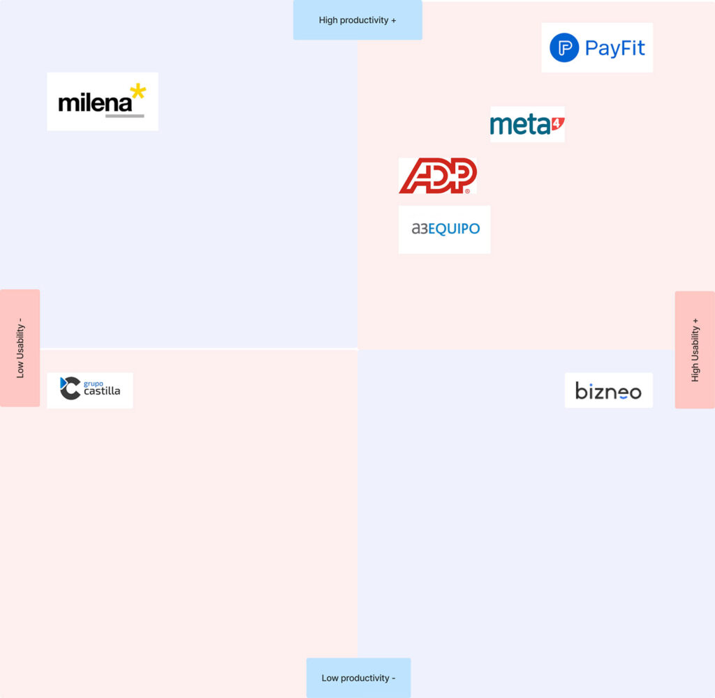
Competition map
Analysis of the competition map revealed that the company could improve its services in several areas. This could have limited their ability to compete with companies that already offered these services. To overcome this disadvantage, the company could expand its offerings by offering better services. This would allow you to compete with established companies and increase your income.
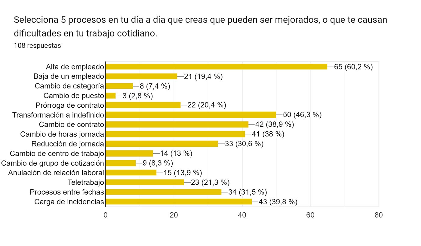
Survey
The survey surveyed almost 150 people and provided me with valuable information about the functioning of the organization and the opinions of its employees. This information allowed me to make informed decisions about how to improve the organization, identifying areas of improvement in its processes and procedures, implementing changes that improve efficiency, and improving employee satisfaction.
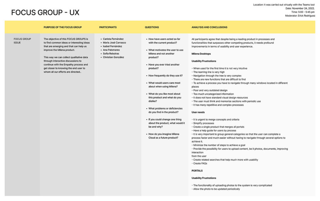
Focus Group
I used it to obtain information about user opinions and experiences, it helped me better understand the needs and expectations of employees, candidates, and stakeholders, generate innovative ideas for new products, services, and processes, and improve communication with the client. Before starting, I defined the objectives I wanted to achieve, I tried to ensure that the focus group was relevant and that the results were useful, I selected participants who were diverse and with different perspectives, I tried to make the script clear and concise, I included open-ended questions so that the participants could express their opinions and experiences fully, despite not being an expert in this empathy technique, I was able to direct the conversation and obtain very valuable information from the participants.
Context
Context analysis had been performed to understand the environment in which users interacted with a digital product or service. This analysis focused on the environmental, social, and psychological factors that influenced the user experience.

Benchmarking
I applied benchmarking as a management tool that allowed me to compare the practices and processes of an organization with those of other leading organizations in the same sector. In the context of human resources companies, benchmarking was a valuable tool to improve the efficiency, effectiveness, and competitiveness of the organization, I was able to identify the best practices that are being used in other organizations, and areas in which they can be improved. , opportunities and lead to an improvement in the organization’s position in the market.

Hypothesis
This hypothesis has been specific because it defines the problem that is being tried to solve: the low adoption of the desktop application by users due to its levels of complexity. The proposed solution is to add more enhancement features that allow users to use the application according to their needs and in an easier way.
- 100% of users who use Milena need to increase the usability and design of the interfaces
- Users are urged to merge concepts and criteria to increase productivity due to the large amount of uncategorized information
- They need navigation not to be so complex since it makes it impossible for them to find new functionalities
- 90% of Users master the Milena product but despite being a leading product in functionalities, it has repetitive and complex processes
2-Define
Brief
I defined the objectives, scope, and restrictions of the project through a process of research and collaboration with stakeholders. This allowed everyone involved in the project to be on the same page and for the project to be developed effectively.
Current situation
Although Milena desktop is a leading product in processes and functionalities that surpasses other competing products, it needs profound improvements in terms of usability and user experience.

Motivation (pain points)
When used for the first time Milena is not a very intuitive product, the learning curve is very high, navigation through the tree is very complex, there are new functions that are difficult to find, to achieve a process you have to navigate through many located windows in different places, the design is poor and very outdated, it also does not have standard visual design resources, the user must think and memorize sections with periodic use, and it has many repetitive and complex processes.

Improvement
-We want sales to increase by 50% and for Users to feel comfortable and achieve their goals as quickly and easily as possible.
-Simplify all processes by 80%
-Create a single product that merges all portals
-Have a help guide and FAQs for users by process
-Group General Categories so that users can complete the processes faster and much easier without having to navigate through several options to achieve it.
-Minimize the number of steps to achieve a goal
-Increase to 100% the possibility that users can upload content, be it photos, documents, improving user interaction
-Create related searches that help usability much more

Limits
We need a solution in 8 months, there are also limits to the size of the project.
Result
Milena desktop users need the product to have profound improvements in terms of usability and user experience. The learning line is very high, navigation through the tree is very complex and to achieve a process you have to navigate through many windows located in different places, it also has many repetitive and complex processes, thus causing the production processes to not be as agile. We want sales to increase by 50% and for Users to feel comfortable and achieve their goals as quickly and easily as possible, simplifying all processes by 100%. We need a solution in 8 months, there are also limits regarding the size of the project and the complexity of the processes.
POV
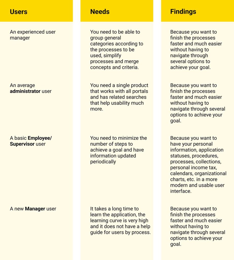
I identified the problems that need to be solved and the solutions that are most likely to be successful.
Result
Both experienced and basic users need profound improvements in terms of usability and user experience, from the most complex interface to the simplest and unifying everything in a single product called Milena Cloud.
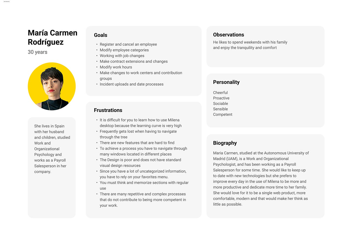
User person
I created a user persona that represented a group of users with similar characteristics and needs. This allowed me to focus on user needs and create solutions that were relevant and effective.
3-Ideate
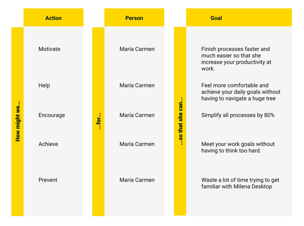
How Might We
To reframe problems as opportunities for innovation, I asked questions that encouraged creative thinking and the exploration of new possibilities. HMW questions are open-ended, broad, and optimistic, and are designed to inspire brainstorming and ideation.
Journey map
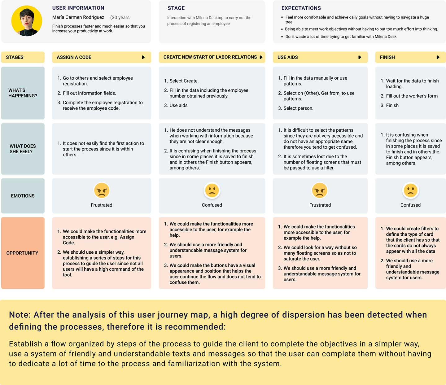
I designed a visual representation of a user’s experience in a key product process, allowing me to understand and identify their needs, pain points and motivations.
4-Prototype
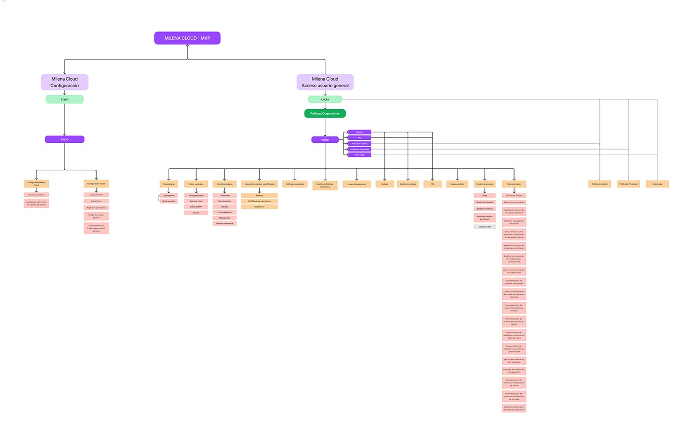
Information Architecture
Information architecture (IA) is a process of organizing and structuring the content of a digital product in a logical and coherent way to make it easier for users to find the information they are looking for. In the context of UX, AI is an essential discipline to ensure that digital products are easy to use and accessible to all users.
Concept map
The concept map helped me understand the content of the digital product, develop an intuitive and efficient navigation strategy, and communicate ideas to other team members in a clear and concise way.
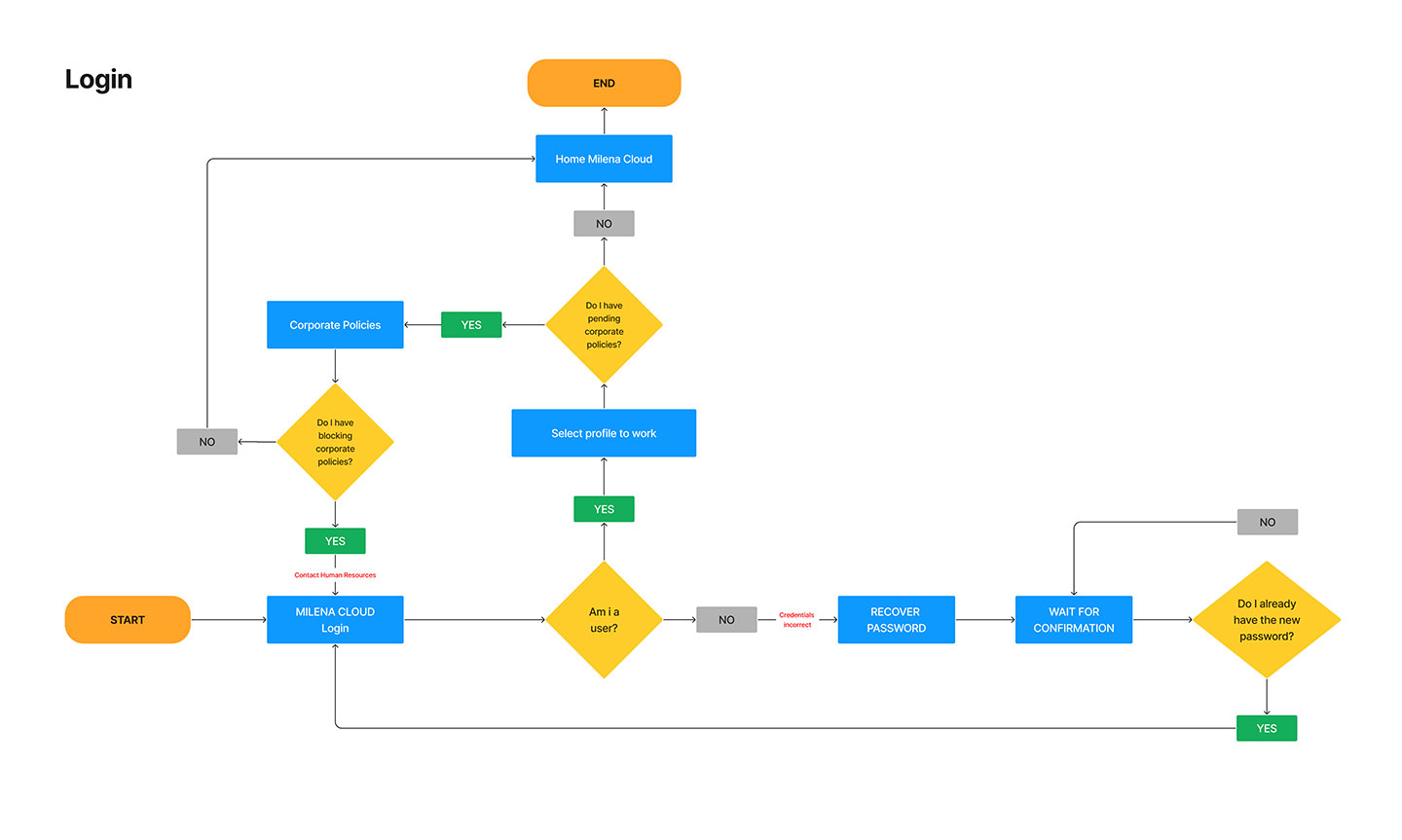
User flow
I used a flowchart to describe the user entry process to Milena Cloud.
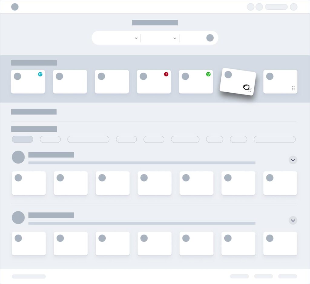
Low-fidelity wireframes
I used low-fidelity wireframes to convey concepts to users and the work team. Its simplicity made it easy to understand and allowed problems in the structure and content of the product to be detected before committing considerable time and effort to development. Furthermore, it allowed me to evaluate various design ideas and find the most appropriate design solution for the users’ needs, which resulted in saving time and financial resources.
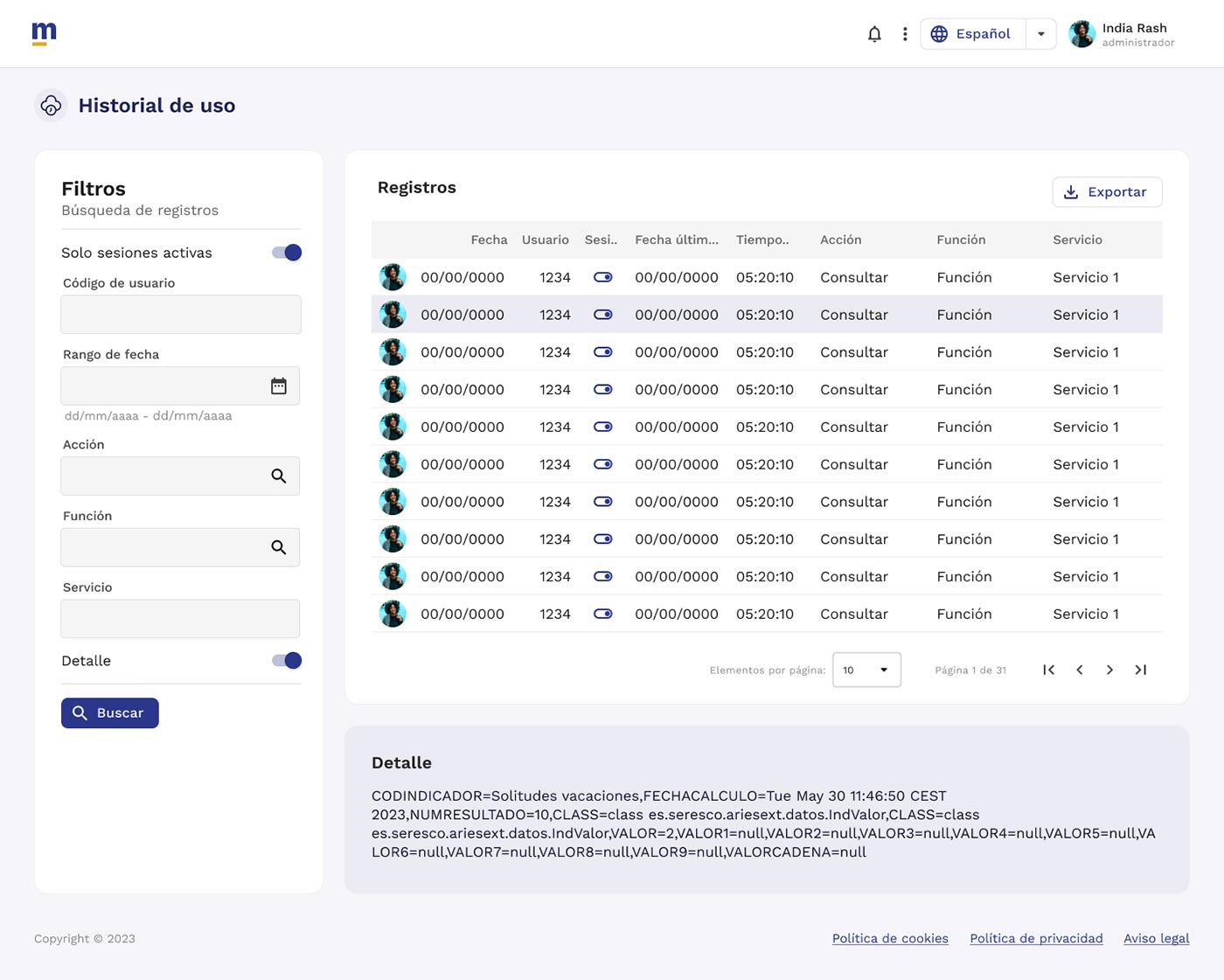
5-Interface design (UI)


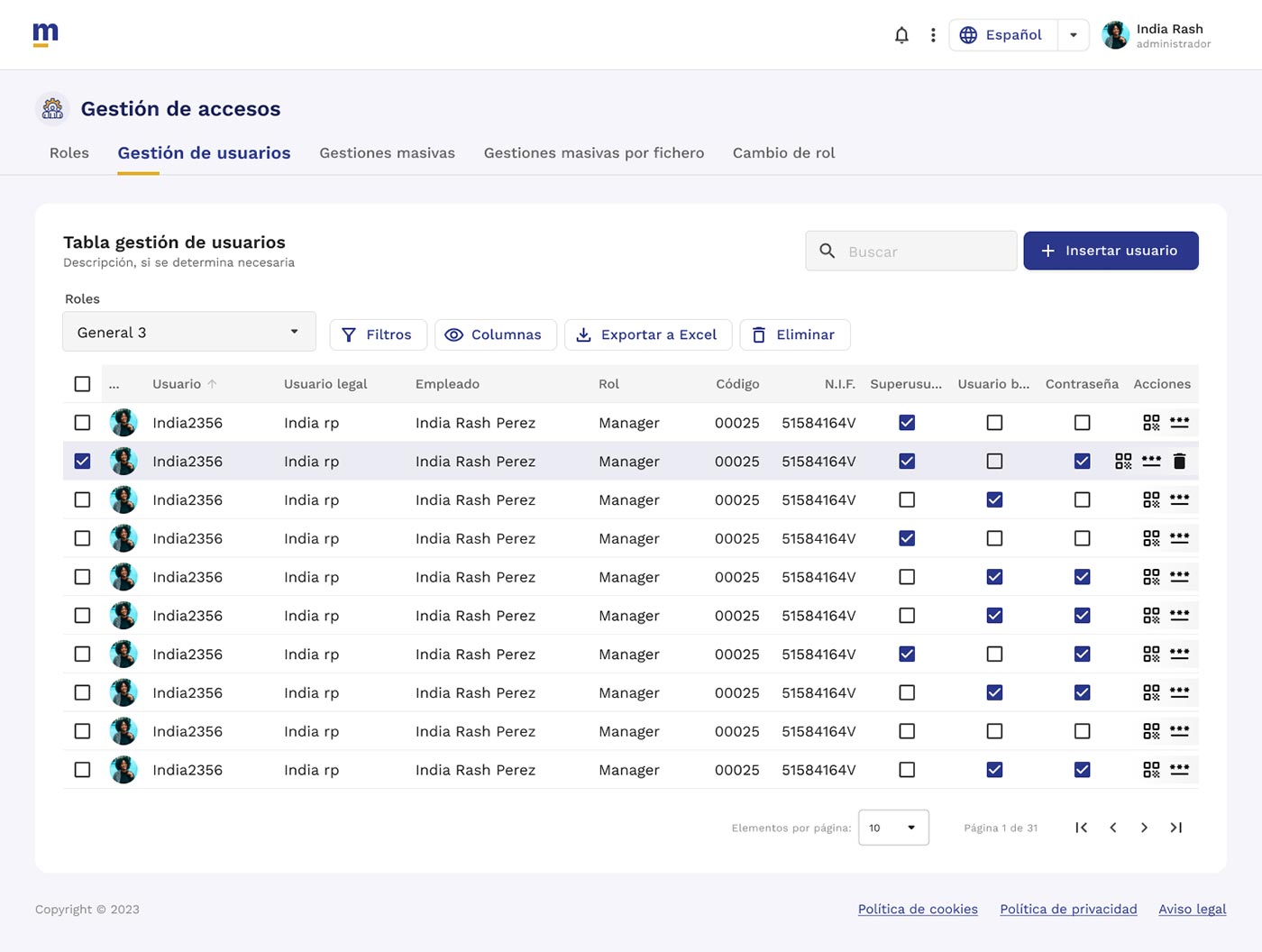
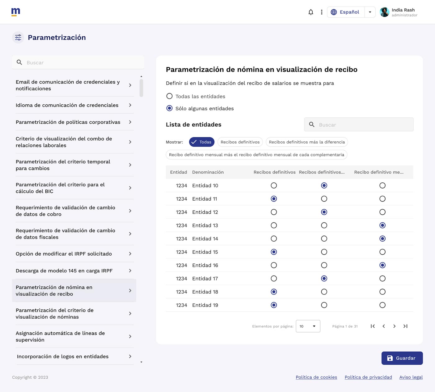
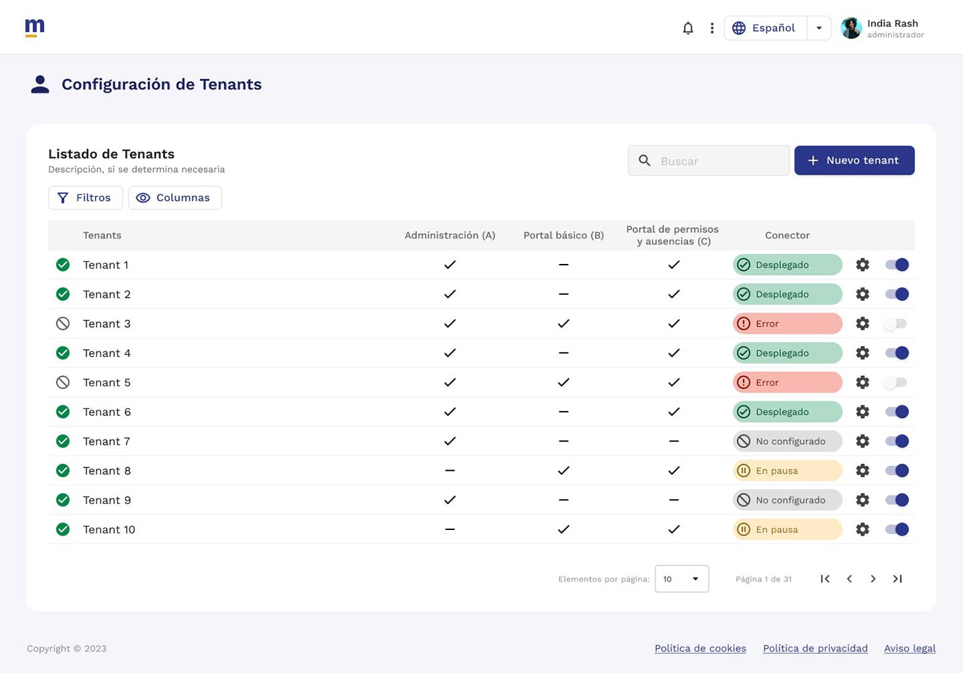
6-Design System
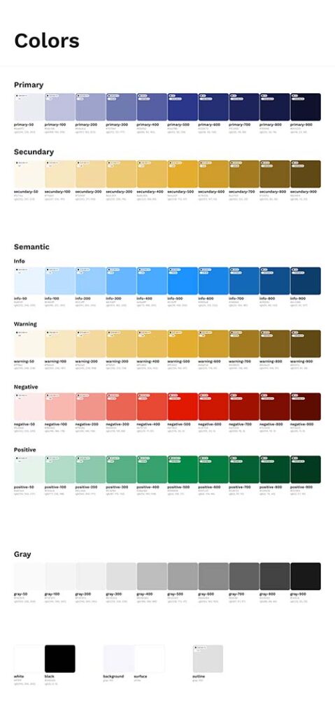
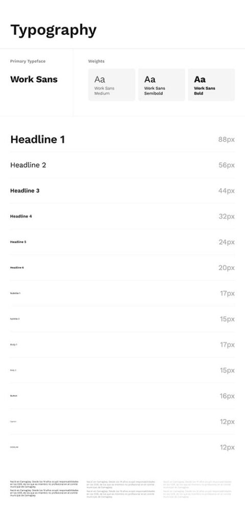
The design system created is aimed at promoting cohesion, accessibility, and efficiency in the development of digital products.
Style guides
- Branding
- Colors
- Typography
- Elevation
- Radio
- Icons
- Layout
- Illustrations
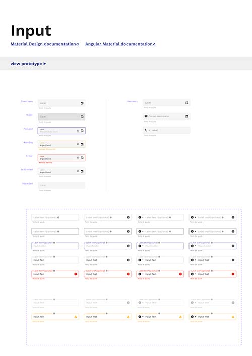
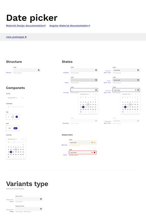
Component Library
- Component name
- Documentation
- State
- Prototype
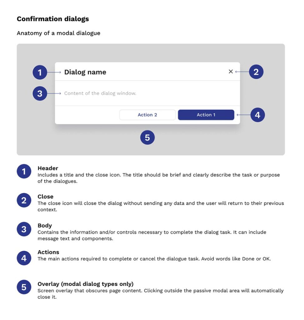
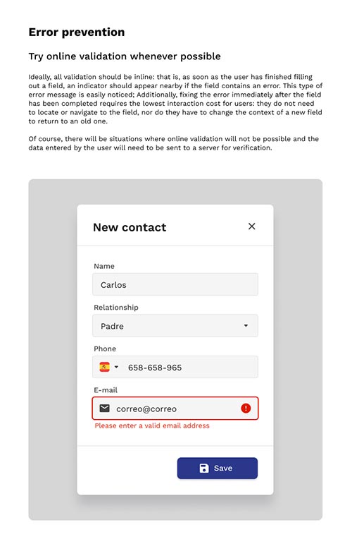
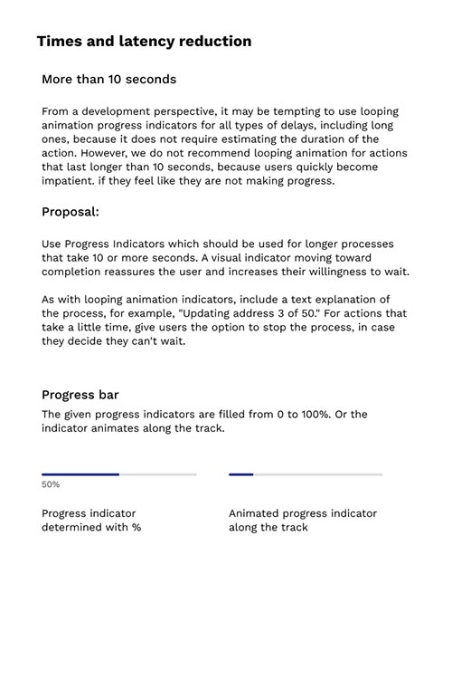
Design Pattern Library
7-Responsive Design
Ensured the user experience is consistent across devices, helping to establish a strong and consistent brand identity.
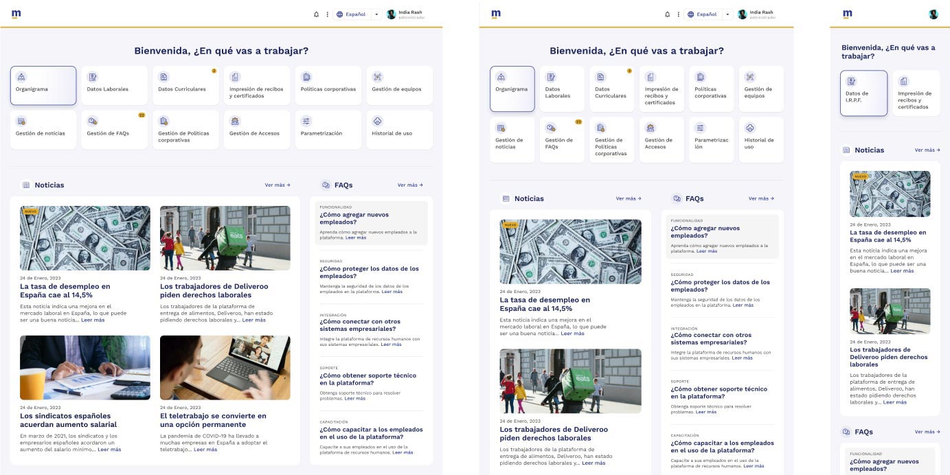
Before / After
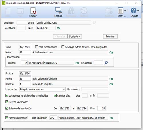
Before:
The original interface featured an outdated and overloaded design. Navigation was confusing, the arrangement of information did not follow a clear hierarchy.
After:
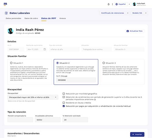
The new interface features a clean and modern design. Navigation has been simplified. The information was organized logically, prioritizing the most important.
This visual comparison demonstrated how design improvements have transformed the user experience, making the product more attractive, easier to use, and more efficient.
Before
After
Conclusions
I am enormously proud to be part of this project. I thank the team for their trust in me.
During this experience, I have strengthened my skills in the Design Thinking phases, which I consider fundamental to achieving a high-quality digital product that is truly useful for users. In the research, stages I went even deeper by applying techniques that were new to me, such as focus groups, benchmarking, and journey maps. In the prototyping stage, I was privileged to have a formidable UI team, and the results were incredible. In addition, I managed to create a very professional Design System, including design patterns that helped the company a lot, especially the development team.
